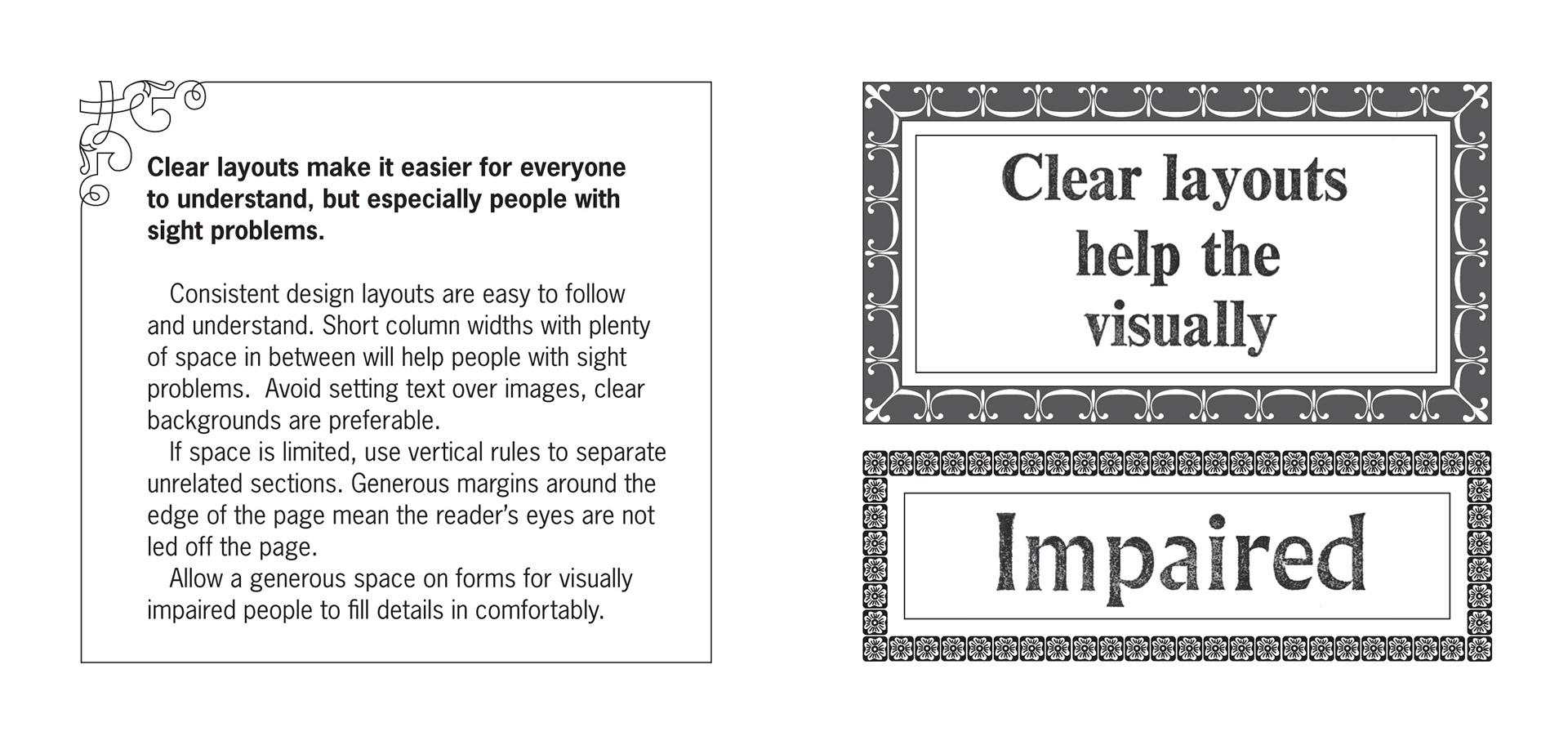
• Work examples
  • York Press - New Prep
  • Philip Allan Magazines
  • Cambridge International Primary English
  • Big Cat Readers - Harper Collins
  • Cover examples - Harper Collins
  • Secure Science - Harper Collins
  • Hello Secondary - York Press
  • Connect project - York Press
  • National Geographic Readers - Harper Collins
Contact
About
  • University projects
  • Font Design for Mill Road Cemetery, Cambridge
  • Community Orchard Signage
  • Cambridge Letterpress
  • Gravestone Type - Mary Hare Font
  • March Vernacular Typography
  • Vernacular Typography
  • Indesign Interactive Digital Document
  • Installation typography
  • Book Design Project – The Capri
  • Fenland Gravestones
  • Vanitas in a Vanity Case
  • Poster and leaflet for All Saints Church
  • Aids Datagram
  • Living Wage Branding Project
  • Clear Design
  • CD cover designs for Taste
  • Fenland Word and Soil Erosion
  • Ism Book Covers
  • Book Covers
Siobhan Brown
  • Work examples
  • York Press - New Prep
  • Philip Allan Magazines
  • Cambridge International Primary English
  • Big Cat Readers - Harper Collins
  • Cover examples - Harper Collins
  • Secure Science - Harper Collins
  • Hello Secondary - York Press
  • Connect project - York Press
  • National Geographic Readers - Harper Collins
Contact
About
  • University projects
  • Font Design for Mill Road Cemetery, Cambridge
  • Community Orchard Signage
  • Cambridge Letterpress
  • Gravestone Type - Mary Hare Font
  • March Vernacular Typography
  • Vernacular Typography
  • Indesign Interactive Digital Document
  • Installation typography
  • Book Design Project – The Capri
  • Fenland Gravestones
  • Vanitas in a Vanity Case
  • Poster and leaflet for All Saints Church
  • Aids Datagram
  • Living Wage Branding Project
  • Clear Design
  • CD cover designs for Taste
  • Fenland Word and Soil Erosion
  • Ism Book Covers
  • Book Covers

Clear Design

The aim of my Clear Design project was to promote good design practice with regard to people with sight impairments and other conditions that may affect how they see and understand Graphic Design work. Each of the cards details small steps we can take as designers to make our work more accessible to a wider audience.

Good contrast
Clear layouts
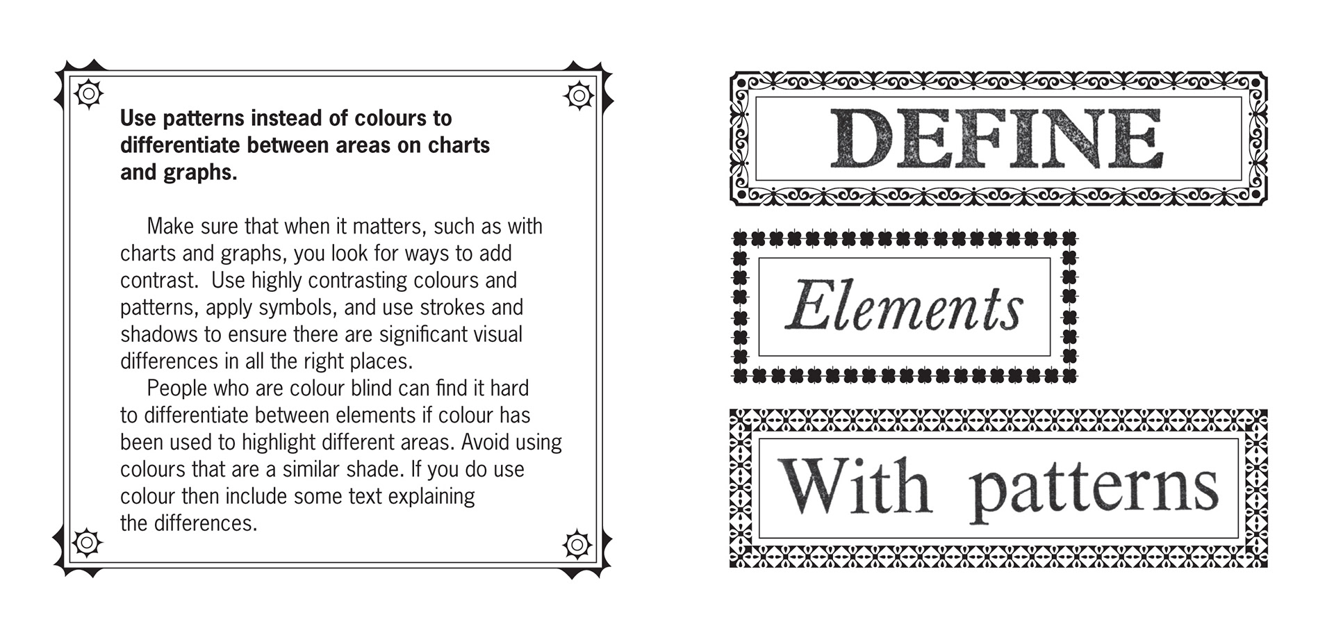
Use patterns instead of colours
Colours that are best avoided
Clear fonts
That materials used can make a big difference
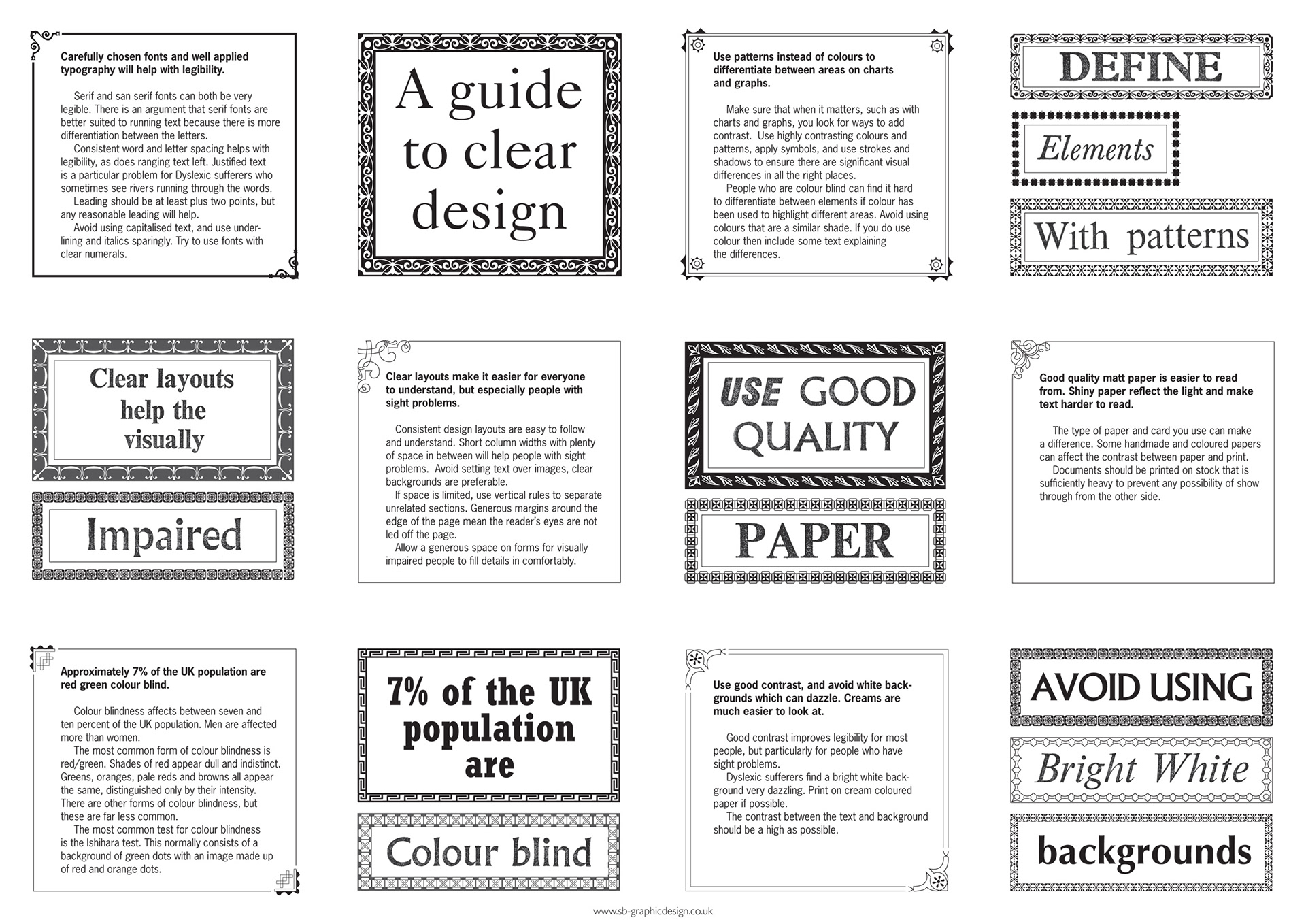
Poster version showing all the cards
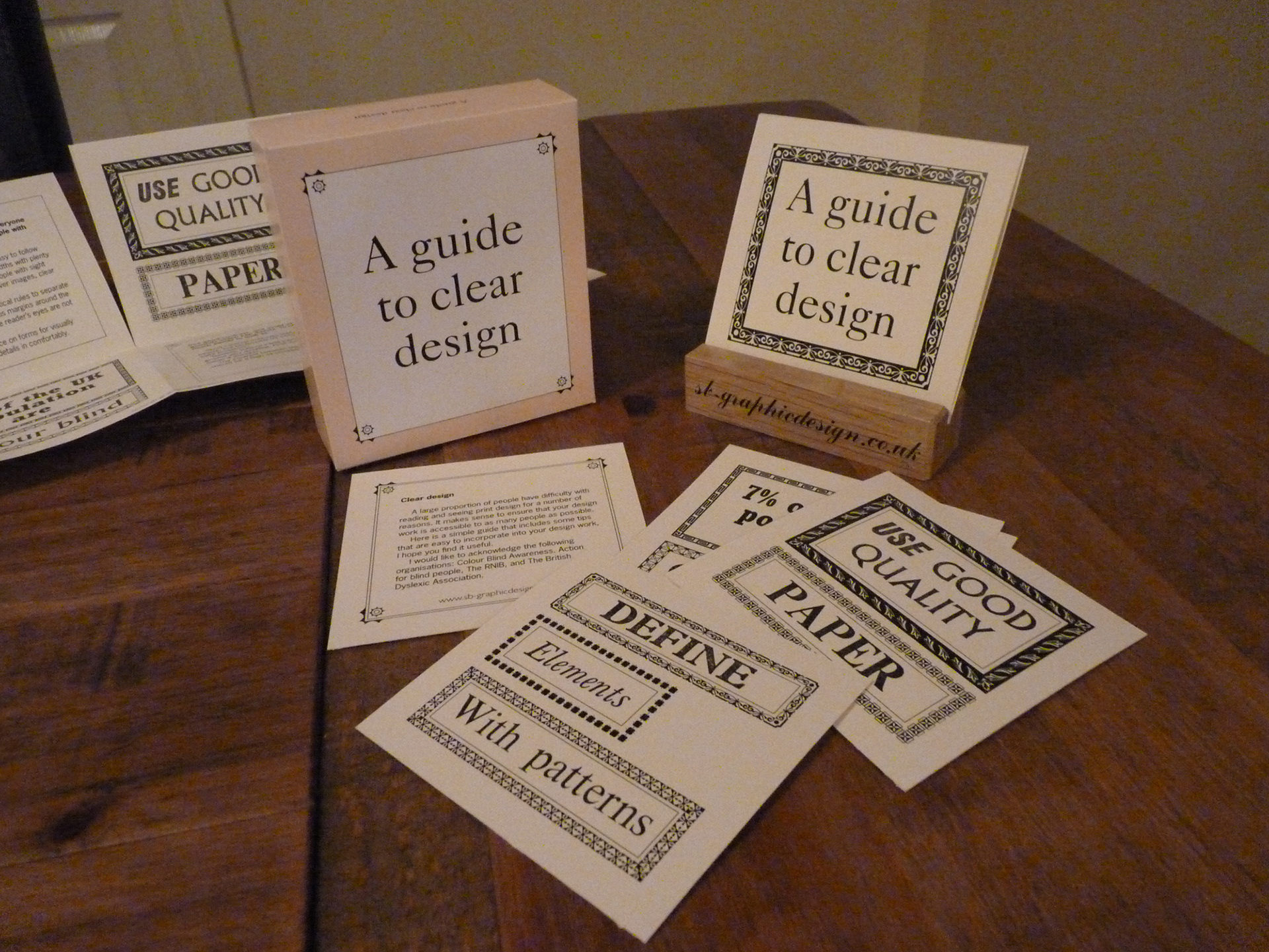
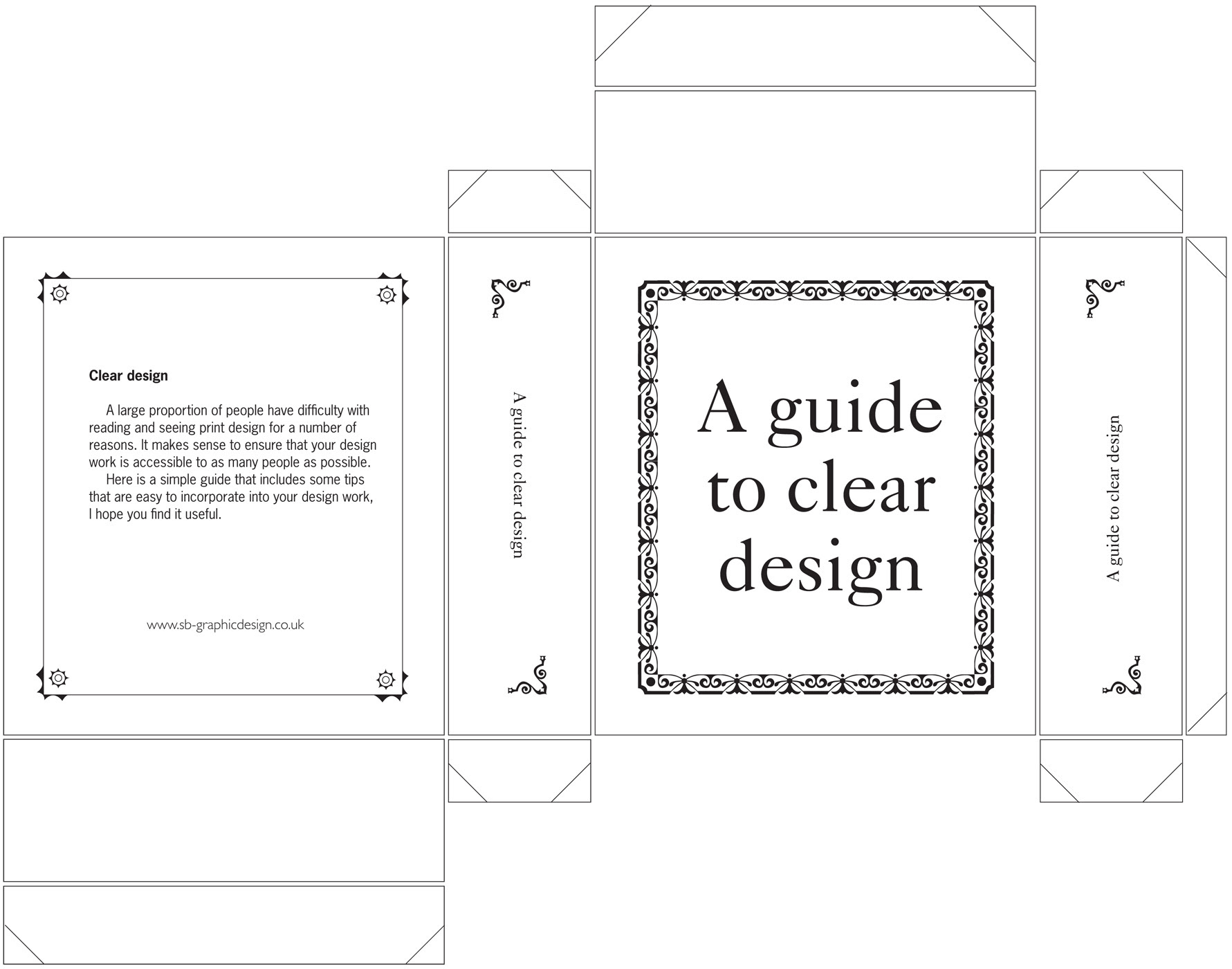
↑Back to Top
Powered by Adobe Portfolio